Introduction
Welcome to the final segment of our alt text masterclass! Either you landed here because you’ve read Part 1 and Part 2, or because you’re ready to go beyond the basics of alt text. Either way, we’re glad you’re doing your part to make the web more accessible and equitable! Since alt text and other types of web accessibility are our business here at Scribely, we want to help you in that endeavor, especially when it comes to the nitty gritty details. So let’s get into fine tuning your alt text writing skills!
How to Naturally Incorporate Keywords in Alt Text (Without Being Spammy)
The primary purpose of alt text is to make visual content accessible to those with visual impairments, but some (mis)use it as a place to stuff in as many SEO keywords as possible (see part 2 of this series for an example).
Don’t give in to this temptation! Yes, alt text can help you to rank better in image SEO, but imagine hearing a bunch of keywords in a row read out loud. Hard pass! You’re providing a terrible experience for screen reader users, AND you’re risking Google marking your site as spam. Thus the rule of thumb is accessibility first, SEO second.
Having said that, it’s absolutely okay and even important to naturally incorporate keywords into your alt text as long as they are relevant to the image content and increase a user’s understanding and/or ability to find the image.

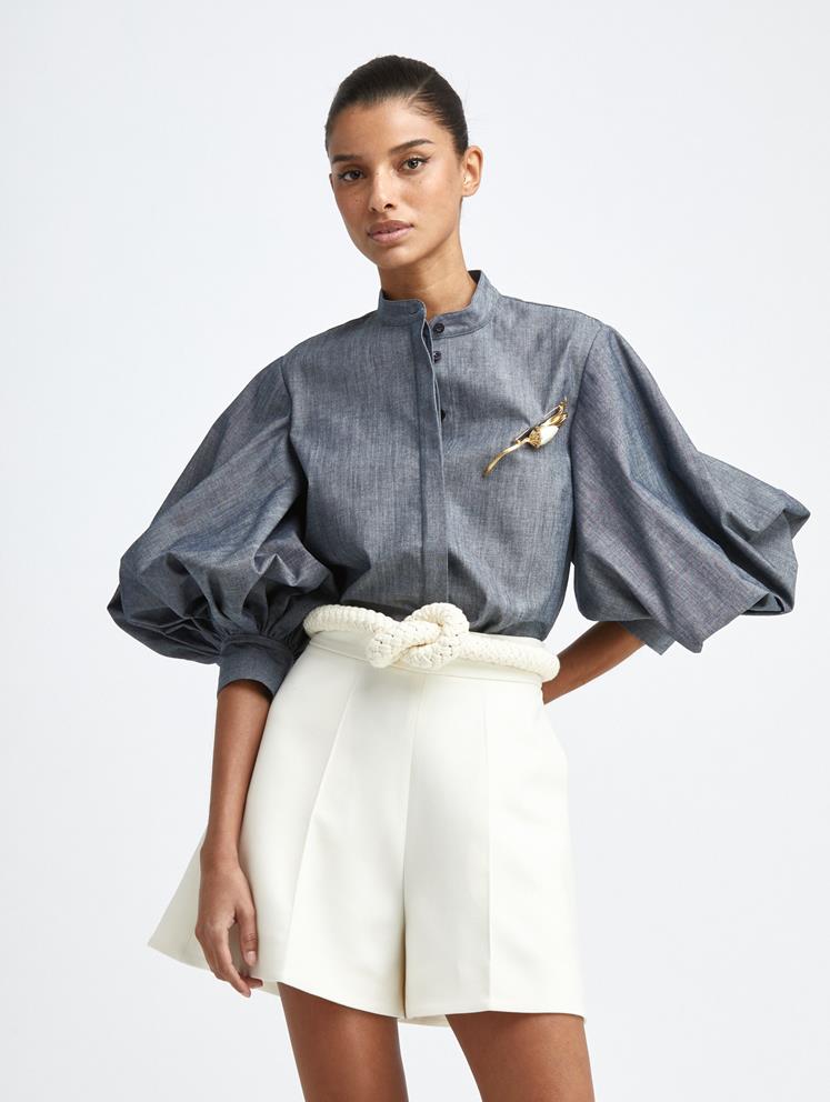
For example, think about what words someone might search to find the Oscar De La Renta blouse in the image to the right and tops similar to it.
The most distinctive feature, of course, is the voluminous sleeves that cinch at the bottom. These balloon sleeves, as they’re called, are relevant to both visualizing and finding the garment, so “balloon sleeves” would be a great keyword to incorporate.
💡 Pro tip: If you’re not sure if it’s important to include a detail, think about what would happen if you didn’t mention it. If that completely changes a user’s understanding or visualization for your context, then it should be mentioned.
The size and style of the sleeve is quite dramatic and large even for a balloon sleeve, so it’d be beneficial to consider words like “full,” “voluminous,” “gathered,” or “pleated.” Describing the brand style and aesthetic is equally important to visualizing the overall style, so words like “chic,” “elegant,” and “modern” might apply. All of these make sense and would be useful to users. So your alt text might read as follows:
Heather gray button-up blouse with modern mock neckline, voluminous 3-quarter balloon sleeves, and straight waistline tucked into high-waisted ivory shorts and ivory rope belt tied around the waist.

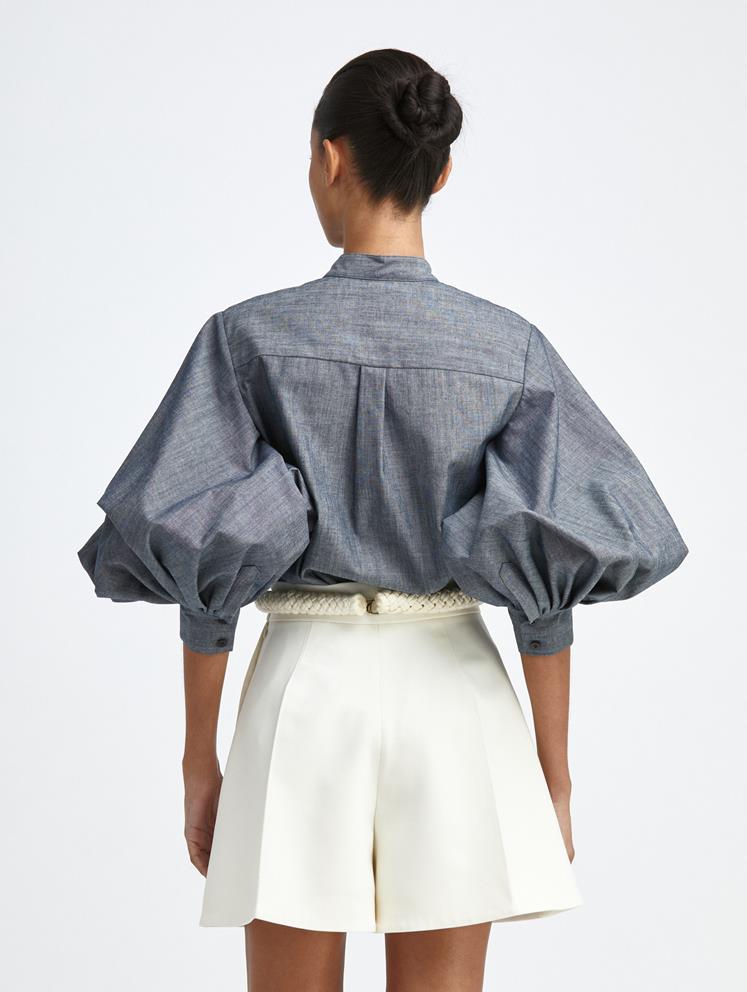
Importantly, if this image were to appear in a series on a product page for the blouse, you would want to describe the different visual details being highlighted by each angle. The images exist to simulate the experience of picking up and examining the garment in person at a store, so our descriptions should do likewise. Start with the primary focus (the blouse), then mention what’s highlighted from this new angle. For instance, if the next photo was of the back of the blouse (right), your alt text might read something like:
Back of the blouse, showing a box pleat down the center, several pleats on the bottom of the sleeves, and 2 small black buttons aligned vertically on each cuff.
💡 Pro tip: Make sure the descriptions of a product from different angles enable you to visualize a 360-degree view of the outfit without having to look at the image.
Leave Interpretation to the Listener
We’ve all had an experience where we observed a work of art or watched a film with a loved one and walked away with a completely different feeling or interpretation than they did. This is part of life and what makes it so interesting (and sometimes frustrating!). But the beauty of the experience is that each of us is allowed to come to our own conclusions; the artist or filmmaker is never there telling you that your interpretation is wrong.
With alt text, it’s extremely important to try to recreate that same experience. Do your best to leave out your own ideas, biases, and interpretations, and simply use descriptive language. You want to give the hearer a complete understanding of what’s there, then remove yourself from the equation so they can come to their own conclusions.
Use Inclusive Language for Age, Disability, and Gender
This rule is both compassionate (be kind by using people’s preferred identifiers) and helpful (getting images that accurately represent what you’re looking for is much better than not). So aim for inclusivity and specificity whenever possible.
But what about when we don’t know how a person identifies? Like gender, disabilities often aren’t visually identifiable, so we would only want to describe someone as something if we absolutely know it’s true. If we get it wrong, it’s horribly offensive and, again, useless.
💡 Pro tip: If you’re a photographer, ask your subjects if they want to share how they identify so you (or your team) can compose an accurate description of them. For images of well-known celebrities, simply look up how they identify.
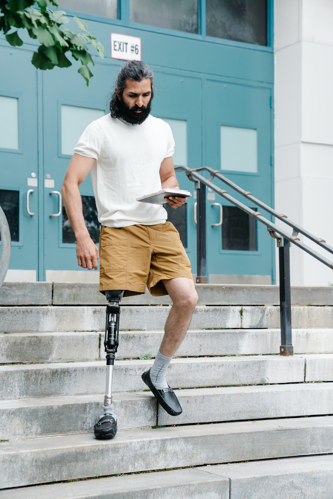
If there’s no way to find out how a person identifies, do your best to use neutral language. For example, the photo below is from Pexels, a free photo repository, so there’s no way to contact the person to ask how they identify. The model appears to be a man, based on what we can observe, and we know he’s using a leg prosthesis, though we can’t observe why. Perhaps he’s an amputee, perhaps he was born this way, so rather than guess, we simply describe what we can:

A man with a full, dark beard using a transfemoral prosthesis walks down concrete stairs holding a notebook in his left hand.
Another special case is images of actors as a character they play. Do you describe the identity of the actor, or do you describe the identity of the character? We think it’s best to go with the latter or both (e.g. “Hunter Schafer as Jules in Euphoria”) if you feel it’s a relevant detail to include.
Moral of the story: Don’t assume. Stay up to date on inclusive language. And if you’re not sure, ask if possible or do some quick research.
Conclusion
Remember when the first iPhone came out in 2007? Touch screen technology was still unrefined, and even other tech moguls couldn’t imagine anyone wanting a device without a keyboard. Yet less than two decades later, it’s hard to remember what life was like before smartphones! Learning new skills, workflows, and technology can be daunting, but just like with the iPhone, they can also become second nature if we’re willing to get through the learning curve. We hope this series flattens that curve for you, saving you time and resources as you implement digital accessibility into your workflows.
💡 Pro tip: If you want to make sure you’re providing a top-notch experience for screen reader users but prefer to focus on doing what you do best, contact Scribely today to let our experts handle all your accessibility needs!

Check out Scribely's 2024 eCommerce Report
Gain valuable insights into the state of accessibility for online shoppers and discover untapped potential for your business.
Read the ReportCite this Post
If you found this guide helpful, feel free to share it with your team or link back to this page to help others understand the importance of website accessibility.


